
Insurance Homepage - B2C App
The goal here was quite straight forward - to design a unified Insurance Homepage that provides intuitive experience to explore, purchase, view, track, and manage Health & Term insurance policies.
Role
Product Designer
Timeline
May 2025 - June 2025
Team
Product Manager
Senior Software Engineer
Existing screen
This was the previous version of the screen, which had certain design and UX flaws.
-
Since health was the first insurance product, there was no entry point for Term.
-
Scattered cards and Unorganised Layout.
-
Visual and hierarchy inconsistencies.
-
No place to show issued policy.


Started with Pen & Paper sketches
Initial concept with Segmented versions
Next step with Wireframes
Moved on to wireframing after analyzing several insurance product apps for reference

Design is not just about what gets built, but what gets explored.
Design Iterations & Rejected Concepts
Not all designs make it to development, and that's okay.
After multiple iterations and stakeholder feedback sessions, I explored several concepts to enhance engagement and clarity in the insurance homepage experience. While these versions didn’t go live due to scope changes, it was a good learning experience.

Concept 1
(Educating users in story format, Testimonials, Swipeable cards)


Concept 2
(Profiling Quiz to calculate protection, Manage everything at one place in Vault)
Why this wasn’t taken forward ?
🔁 Scope Shift: Team prioritised core flows - Product Discovery and Policy Management.
⚙️ Tech and Time Constraints: Tech crunch and tight timelines to release.
🚀 Next Phase: Planned for Phase 2 as potential enhancements after validating core journeys.
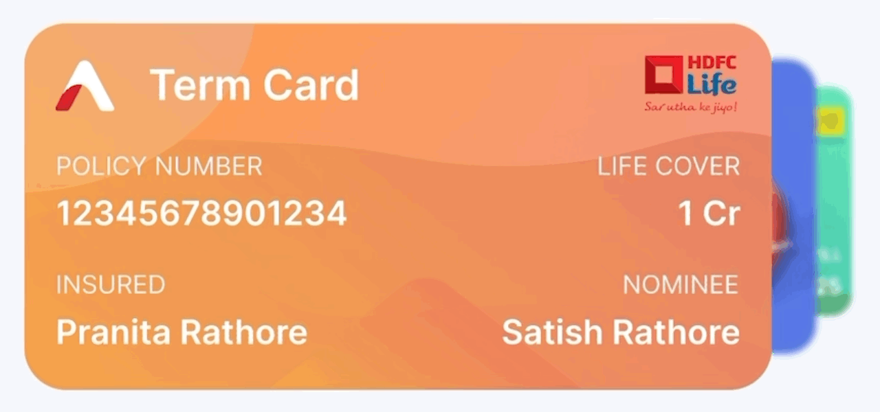
Final Designs
Designed to give users a quick overview and immediate access to core actions—resuming pending applications, viewing policies, tracking status, and exploring new products—all in one glance.

A glimpse of the designed flow


Also, Designed Some Banners


