78789.png)
Case Study - Art Gallery App (All About Art)
Did you ever visit an art gallery and felt “not smart” enough to understand the artwork? or really liked an artwork but couldn't find any options to buy it? or didn’t know that in which category a painting falls in?
Don’t worry. I bet every art lover and enthusiasts must have faced these problems atleast once.
So, as a part of my Google UX certificate course, I took this problem statement to design a solution.
Duration: 7 weeks
Tools: Figma, Miro, Paper, Adobe Express, Canva
My Role: User Research, Wireframing, Prototyping, Visual design, Interaction design
Problem Statement:
Art gallery visitors would like to get more information about the artworks and the artists. Some visitors would also like to buy the artworks and book the tickets beforehand. They need to have a more engaging and interactive experience.
Solution:
This art gallery app will let users to get more articulate knowledge about the artworks and artists by simply scanning the art piece. The app will also allow the users to buy the artwork they like. We will check the effectiveness by taking feedback from visitors of the gallery. I have used “Kolkata gallery” as reference for paintings and artists details.

How will we proceed?
I chose design thinking user-centered approach for problem solving. It emphasis on creating solutions that address real user problem, and which are functional and affordable.
User Research:
I started with conducting surveys and interview. Conducted a survey, received feedback from it and conducted another survey. After those surveys, conducted a small interview. From surveys, I got good insights from larger sample size. Some of the pain points that were gathered are given below.
-
Pain Points:
After the surveys and the interview, I got an idea of what user need. Some of the insightful points are as below.
-
User would like it if the app will have categories divided according to artists and artworks.
-
User would like to book the ticket beforehand from the app for gallery visit or for any events/exhbition.
-
User would like to have more information on the artworks and artists.
-
User would like if there will be a map to guide them in the art gallery.
-
User would like to buy artworks directly form the app.
-
User would also like to share the information they gained or the artworks they liked, with their friends and families.
-
Personas:
Meet our users. I created the following two personas according to the research I conducted from surveys and interview. It is very important to know for whom you are designing and what problem they are facing.
-
User Journey Map:
I understood a general behavior of a person who visits an art gallery. I also got to know about the areas of improvements that can be done for the user.
As we can see, that the person is initially quite excited for their visit. But that slowly decreases as they feel overwhelmed and confused by the lack of information around.
I suggested some improvement qualities that can be integrated in the app.
-
Competitive Audit:
So I tried to understand what our competitions are doing. It's important to consider that how much work our direct and indirect competitors have already done for the users. Studying these companies are a perfect source of information.

All the apps had their own "wow! that's a cool feature", but also "It has lack of ___".
So I tried to adopt their good features and improve on the part which they lack. Most of the competitions had general features like creating profile, scan options, sharing option, and more. But also, some of them lacked in important features like languages, text to speech function, difficult navigation, etc.
The applications which I used for the audit are these.

Smartify

Artier

Sotheby's

NGMA
Maritime Museum
Ideation:
I came up with some ideas from the insights gathered during the research phase to solve this problem. I will explore the storyboards, crazy 8's and user flow in this process.
-
Storyboards:
I created two storyboards based on the 2 main problems. User's first pain point is when they need to get more information about the artwork or artists. And second pain point, when they like an artwork and would like to buy it.
These storyboards visually describes the user's experience with the product. After all, telling a story with visuals is more effective then describing it into the words.
User's scanning artwork experience
User's buying experience
-
Crazy 8's:
Crazy 8's activity challenges us to sketch some eight ideas in limited time. This fun activity helped me to design the creative idea that comes to your mind first.
The eight ideas which I designed are:
-
Book online tickets
-
Scan the artwork and get the information
-
Map of the art gallery
-
Screen reader option
-
Multiple available languages
-
Buy artworks
-
Like, share and save the artwork page
-
Share on social media
Crazy 8's
-
User Flow:
User flow explains how user will interact with our App. It gives us more clear vision on the path our user will take, how they will complete a task from start to finish. The goal is to map how users achieve a specific task as they move through the app.
On the home page, I kept both artworks and artists there, as it is the most important thing that our user need. Other important options: Scan, book ticket and buy are on the Home page as well. Other secondary features will be placed inside hamburger menu.
(PS: There was some changes in the flow when we tested after prototype.)
Wireframing:
So the one of the most crucial step in the process is wireframing. It is called as skeleton of user interface. Wireframing helps us to visualize the product. Also it is cost effective as I can test and make as many iterations as I want, before moving on to the prototyping part.
-
Paper Wireframe (sketching):
Now that I have a flow, it's time to decide the layout of the product, how the app will look. It's good to have 4-5 iterations of one idea and then come up with the best one or combine the best features of all the iterations.
Here I designed 5 screens of the Home page and finally combined it into one final design.
Sketches of Home page layout and then one finalized design
I created more designs of Bio, Buy, Payment, Book and Login screens. These are the final design from 4-5 iterations of each screen.
Sketches of more screens
-
Digital Wireframe:
After completing the paper wireframe, I moved on to the digital wireframe to design the final sketches. This wireframe was created in Figma. Currently I added some main frames in digital wireframe. More frames will be added in the prototyping phase.
Digital Wireframe
Prototyping:
Low-Fidelity Prototype
It's time to create a flow in the wireframes. I modified out digital wireframe, added more screens and connected the screens to make a Low-Fidelity prototype.
You can try out the Lo-Fi prototype here: Low-Fidelity Prototype
Lo-Fi Prototype
-
Testing:
To test the Lo-Fi prototype, I conducted a usability study with 5 participants. In this study, user were given some tasks to perform on the prototype like find the languages menu, buy an artwork, book ticket to visit, etc. After the usability study was done, I made changes and improved the prototype according to the feedback I received from the users.
Problem-1
Before
So before, the languages option was at Menu -> Settings -> languages.
What user think?
When I gave this task of "go to languages" to the 5 users, 2/5 find it difficult to complete it. One user was unable to find the option. Another said that language option is priority and should be easily seen with a simple click.
After
With the help of users feedback, I changed the position of languages option and placed it simply into the menu. So now, the languages option is available in Menu -> Languages.
Before and After frames
Problem-2
Before
I made a bag like icon for buying artwork option.
What user think?
When I gave the task of buying an artwork to the users, 4/5 were confused with the icon. They couldn't understand the icon and found it difficult to complete the task. Two users mentioned that instead of a bag, it looked like a lock.
After
I changed the icon of buying option for better understanding of the users. Anyway, the icon would have been easy to understand if it was in the Hi-Fi prototype. But this made me realize that how much iconography is important and I should keep the icons simple, clean and also with the text label for easy understanding.
Before and After frames
There were also some tiny issues with navigation, which I solved in the Hi-Fi prototype.
High-Fidelity Prototype
Its time to move on to the most interesting and visually appealing part of the project: High-Fidelity prototype. The Hi-Fi prototype gives a really good idea of how the app will look. This is the closest resemblance to the final design.

Hi-Fi Prototype
Quite confusing right??
Don't worry! I'll break it down
Main 4 Frames
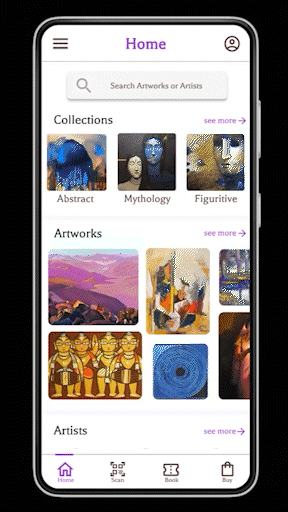
So the menu in the app consists of 4 important options: Home, Scan, Book, Buy. I will elaborate them further later.
Artworks and Artists
I organized everything according to: Artists, Artworks and Collections. During the survey, I observed that user would like to have various options while browsing. So I divided them accordingly.
The about page will have several options like: Like, save and sharing of the page, screen reader for people with disabilities and a wallpaper option (User will be able to save the beautiful artwork directly as their wallpaper).
Scroll down to the page, and the artists section can be seen here
Scan the artwork
Easiest way to get to know your art. Just simply point the scan camera on the painting, it will scan and open all the details of it. Simple right?
Scan GIF
Book your visit
Booking visit is important part of art galleries, but it is not always an easy task. I made the booking easy by simple step by step process.
Check the entry charges -> Enter Name, Contact details and date -> Select time slot and number of people -> Select payment method -> And Voila!!! your booking is done.
You can now download the ticket and even share it with other members as well.
Buy artworks
There are many art lovers who do not only like to learn about the art but also like to buy them. Again, I have created a very simple step by step by step process to buy artworks which are available for sale.
Choose the artwork you like -> Check its price, details and add to cart -> Confirm details and buy -> Select payment method -> and Yeahhh!! you purchased your artwork.
Some other important features
So I didn't forget the pain points of the users. Either difficulty with languages or difficulty while navigating the gallery, I integrated different languages as well as the map of the art gallery. Also the Menu and Profile buttons have many features.


.png)


.png)


Try out the High Fidelity prototype on the below link:
Style Guide:
I used engaging color palette with #9330CF as our primary color, a bold typography with the font "Balthazar", customized posters, interesting color contrast between buttons, classic Google's iconography and easy navigation icons. The style guide is consists of all these things.

Style Guide
Learnings and Next steps:
This is my first ever UX project and I'm happy with the overall design and product. This was the most fulfilling and satisfying experience. I learned a lot in this process. How an idea can be turned into a whole product is really amusing.
I learned that how user's feedback is really important and helpful in the process.
The area I think I can do better in is Visual designing part.
Important thing is to keep learning and creating.
Next Steps:
1) Adding more frames in the prototype for more easy navigation.
2) Understanding user's preferences and providing personalised suggestions of new artworks and events.
3) Conducting another round of usability study to validate whether user's all pain points are addressed properly or not.
